![](https://www.annasalome.com/wp-content/uploads/2023/07/1-2.gif)
![](https://www.annasalome.com/wp-content/uploads/2023/07/2.jpg)
![](https://www.annasalome.com/wp-content/uploads/2023/07/3.jpg)
![](https://www.annasalome.com/wp-content/uploads/2023/07/4-1.jpg)
![](https://www.annasalome.com/wp-content/uploads/2023/07/5-1.gif)
![](https://www.annasalome.com/wp-content/uploads/2023/07/6.gif)
![](https://www.annasalome.com/wp-content/uploads/2023/07/7-1.jpg)
![](https://www.annasalome.com/wp-content/uploads/2023/07/8-1.jpg)
![](https://www.annasalome.com/wp-content/uploads/2023/07/9.gif)
![](https://www.annasalome.com/wp-content/uploads/2023/07/10.jpg)
![](https://www.annasalome.com/wp-content/uploads/2023/07/։-scaled.jpeg)
![](https://www.annasalome.com/wp-content/uploads/2023/07/DSC5211-scaled.jpeg)
![](https://www.annasalome.com/wp-content/uploads/2023/07/DSC5255-scaled.jpeg)
![](https://www.annasalome.com/wp-content/uploads/2023/07/DSC5325-scaled.jpeg)
OLYMPEAH
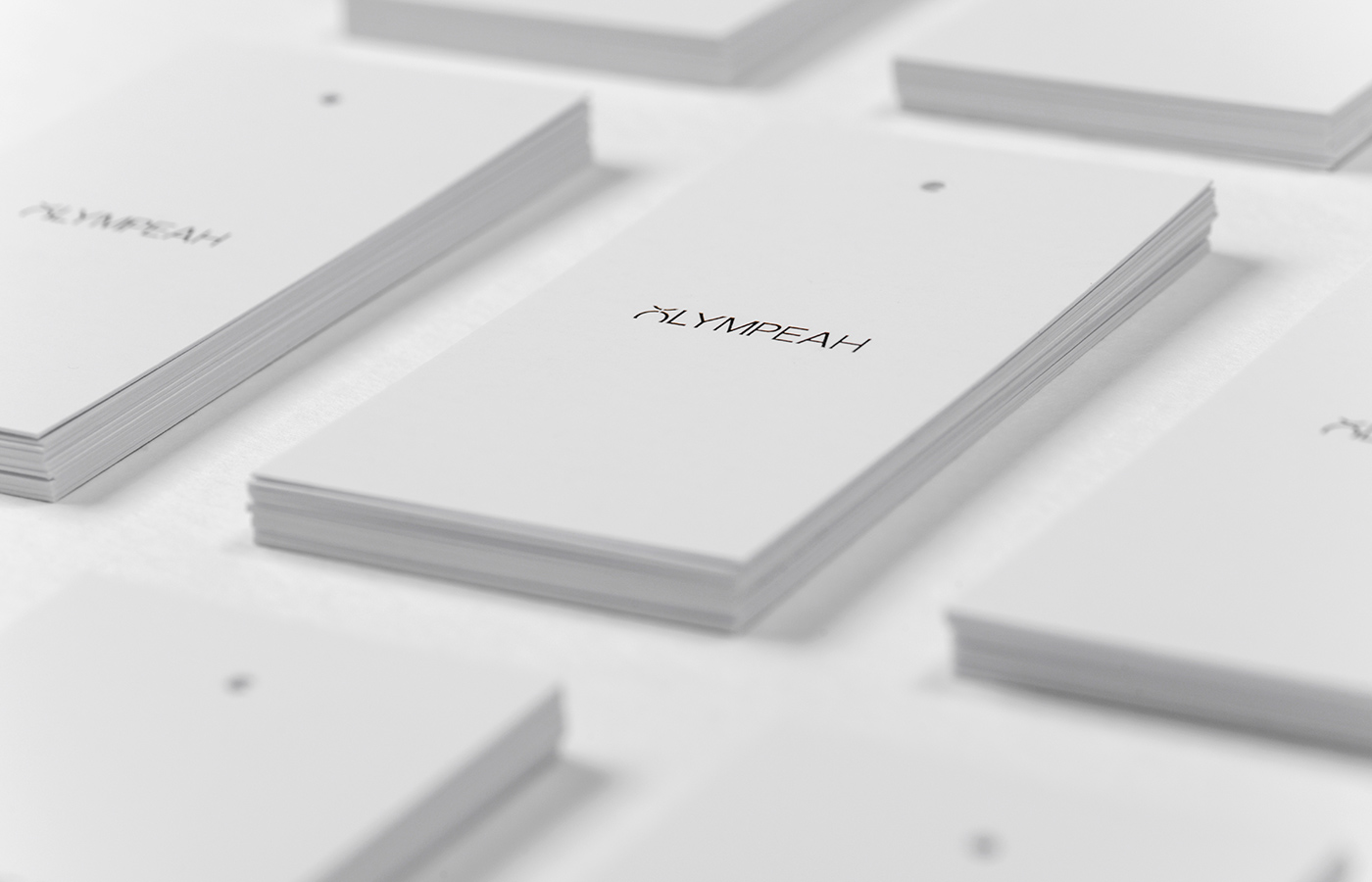
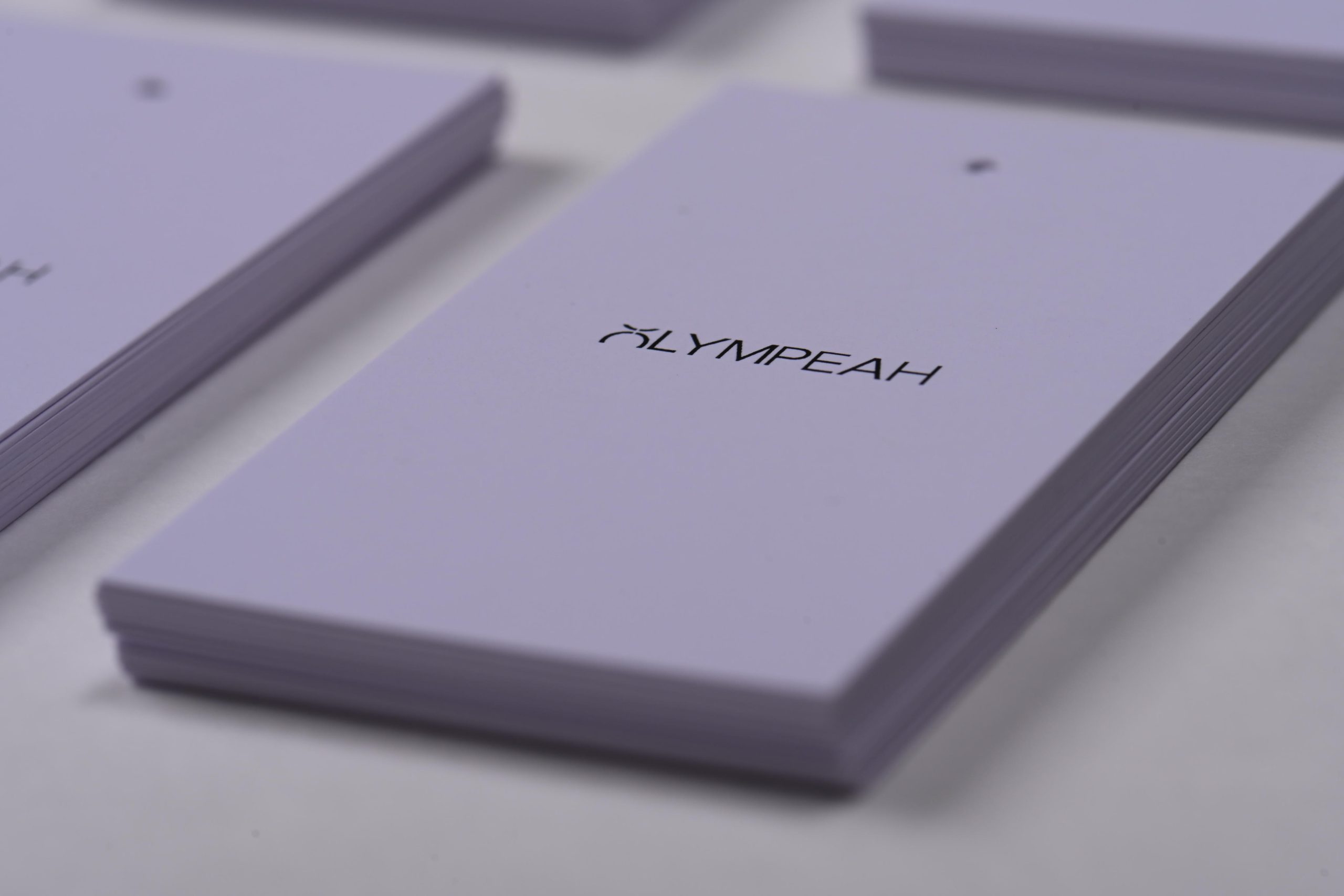
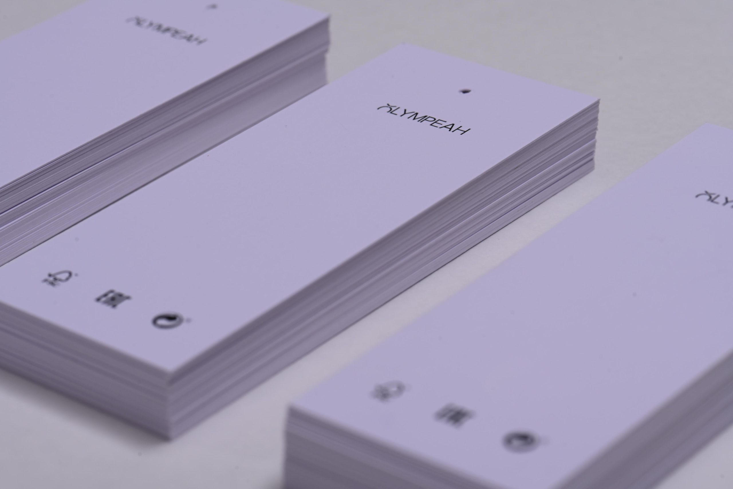
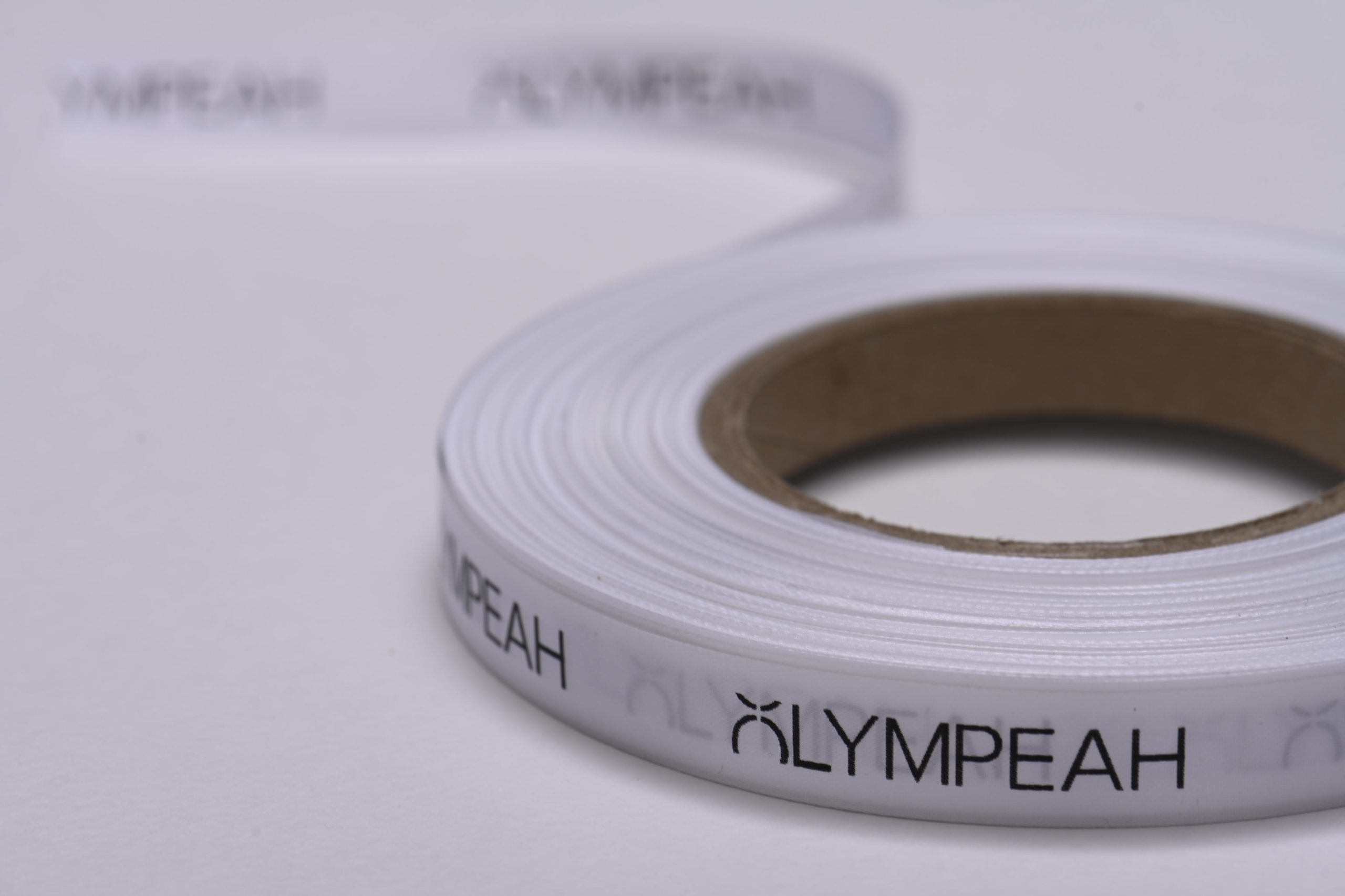
During the branding process, one of the key elements we focused on was creating a distinctive and memorable logo for Olympeah. Taking inspiration from the brand’s essence and desire to make a unique statement, we divided the letter “O” in a visually striking and asymmetrical way.
We selected green as the primary color for the logo, representing freshness, vitality, and a connection to nature.
We incorporated white as a secondary color to complement the primary color, symbolizing purity, elegance, and simplicity.
Tagged branding